Exploring Population Data from the United Nations
Exploring population data (such as life expectancy and fertility rate) obtained from a United Nations API in many fast and slow-growing countries.
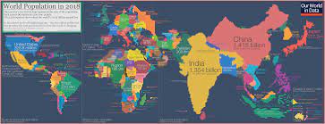
I gathered data from a United Nations public API. The UN provides data on a vast array of variables for all of its members. I read this interesting article from Forbes about world population trends. To briefly summarize (though I suggest you read the article), the world population has now reached 8 billion people, but researchers say that most of the growth over the next 80 years will come from a handful of countries. I thought, why not explore the data from this handful of countries and compare it to minimal-growth first-world countries such as Japan and the USA?
I created all of my plots using the matplotlib and pandas packages in Python. Remember to check out my code in my Github repo to see how all of these plots and tables were created, and check out my scraping population data article to see how I used the API to gather our data.
Now, we begin exploring.
This first graph models the variable fertility rate over time.
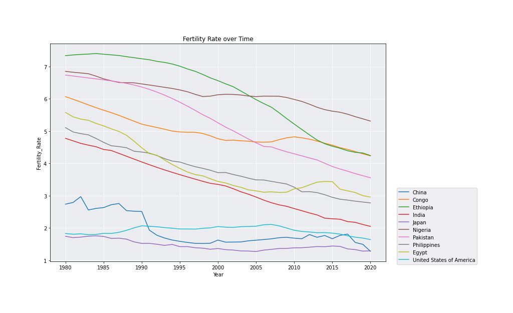
It seems to me that every country, whether it be labeled as “fast” or “slow” growing, has a declining fertility rate. The first world countries China, Japan and the USA have always had low fertility rates, but even they have declined over the past 40 years. Countries like Ethiopia, India and Pakistan, who all had fertility rates over 6.0 in 1980, have all dropped by over 1.0, with Ethiopia dropping from 7.5 to 4.5. And yet these countries are still contribuing largely to the world’s population growth.
How can nations with such rapidly declining fertility rates still grow so much? These next two plots may hold some answers.
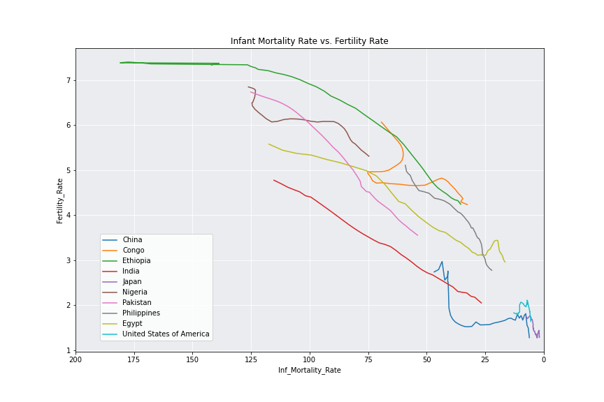
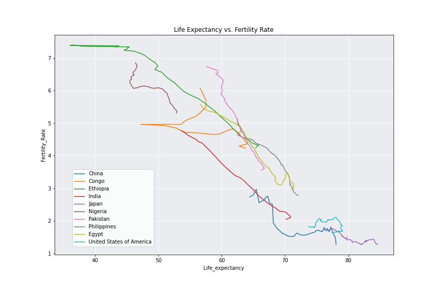
It seems that, though all nations have experienced declining fertility rates over time, they have also experienced huge jumps in life expectancy and huge drops infant mortality rate. This means that, though less babies are being born, more are surviving, and they are living much longer lives. Is this rise in life expectancy and drop in infant mortality rate enough to counteract lower fertility and birth rates, enabling populations to still grow? According to the Forbes article, yes. And according to this next plot, we may agree.
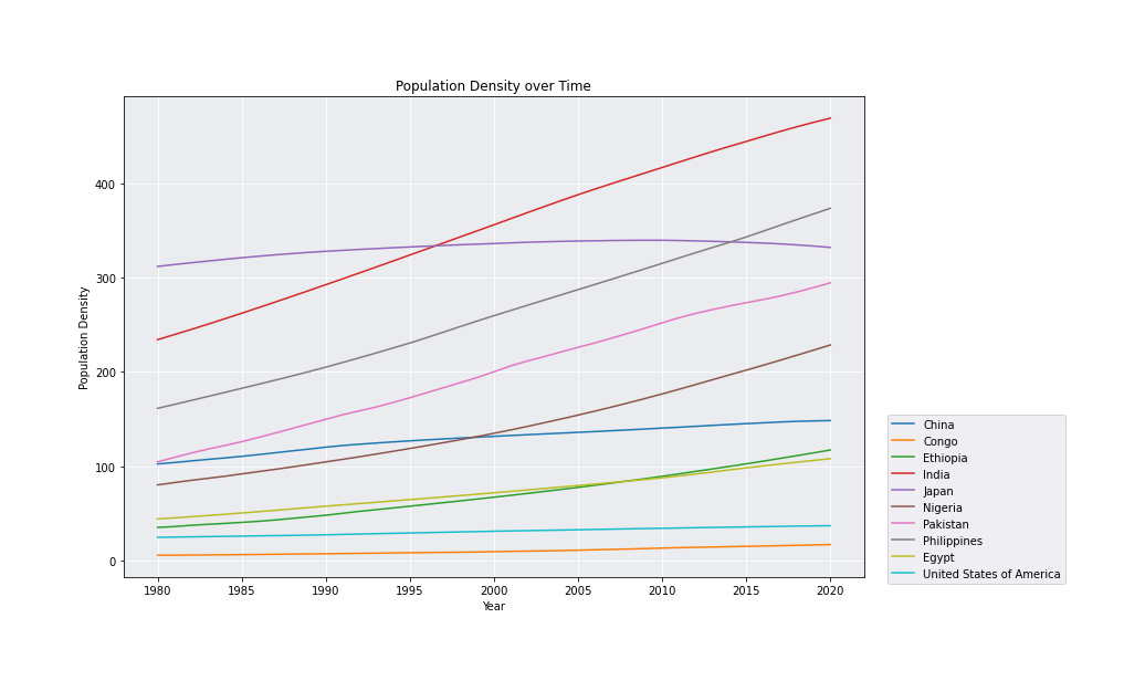
Despite lower fertility rates, population density is skyrockting in each of these high-growth nations. While the first world nations Japan, China and the USA are not increasing, they aren’t decreasing. Japan has a slight parabola, but they are still higher than they were 40 years ago. Nigeria and Pakistan - who are predicted to overtake the population of the USA in 20-50 years - have exploded when it comes to population density! It seems that lower fertility rates have not been enough to subdue rises in life expectancy and infant mortality rates.
I also thought it would be neat to explore just how much these statistics have changed over these 40 years. These tables show us where the nations were at in 2020 and then by how much they have changed in the 40 years.
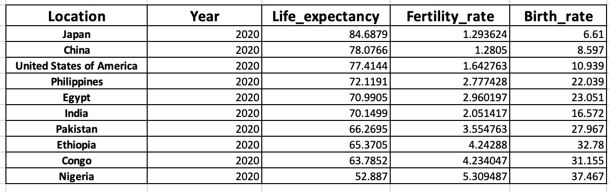
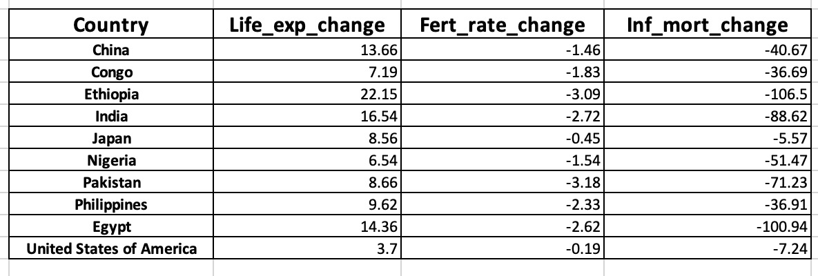
It is exciting to see that all life expectancies of these nations are now over 50. That shows just how influential technological and medical advances have been on all continents of the world. When we examine how much life expectancy has changed over the past 40 years, we see that some nations have added over 10 years to the lives of their people - Ethiopia has added 22! What a fortunate time to be born.
It is also interesting to note that, as demonstrated in a previous plot, life expectancy and fertility rate seem to have a strong negative correlation - as a nation gains greater life expectancy, fertility rate plummets. The first table is organized in descending order by life expectancy. That almost matches the order of fertility rate in ascending order! It seems that when people know their kids will live long lives, they don’t feel a need to have so many. Every nation in our list experienced this. All saw an increase in life expectancy and a decrease in fertility rate - some more than others - over the past 40 years. I wonder what this will look like in 2050?
In my next post, we will perform statistical analyses and see if we can make predicitions about populations in 2050 and beyond. In the meantime, think to yourself, how will the world be different when we reach 10 billion people? 12 billion? How many people will we have on this Earth at one time?